Northbank Terminal
Wayfinding for a building that never closes
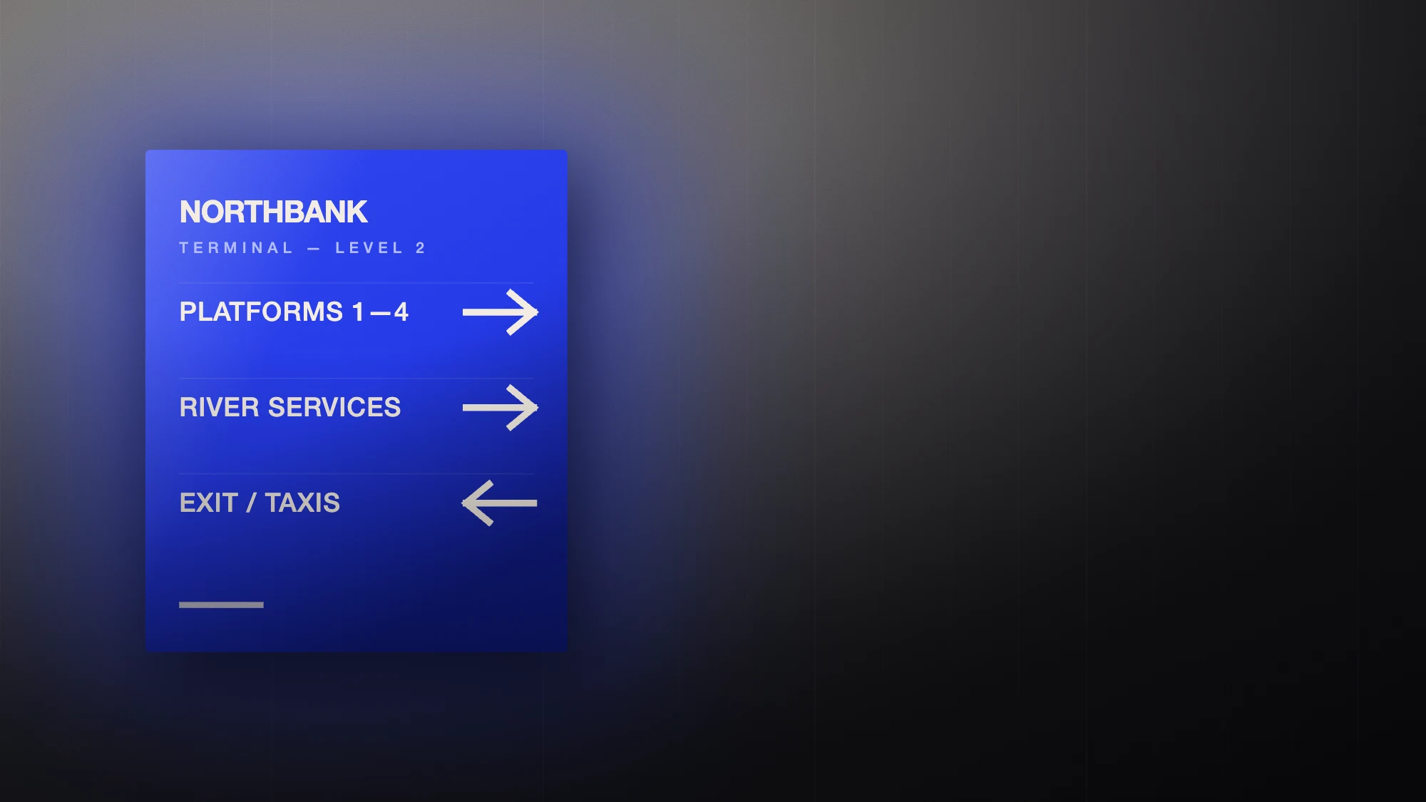
Northbank moves eleven thousand people a day through a concrete shed with no natural light. The brief was not to decorate it. It was to make the building legible at walking pace, from thirty metres, in the rain, at four in the morning.
- Spatial identity, signage and screen system
- 24-hour river terminal, 4 levels
- Sign manual, fabrication drawings, screen UI kit
- 9 months
Designing for the glance
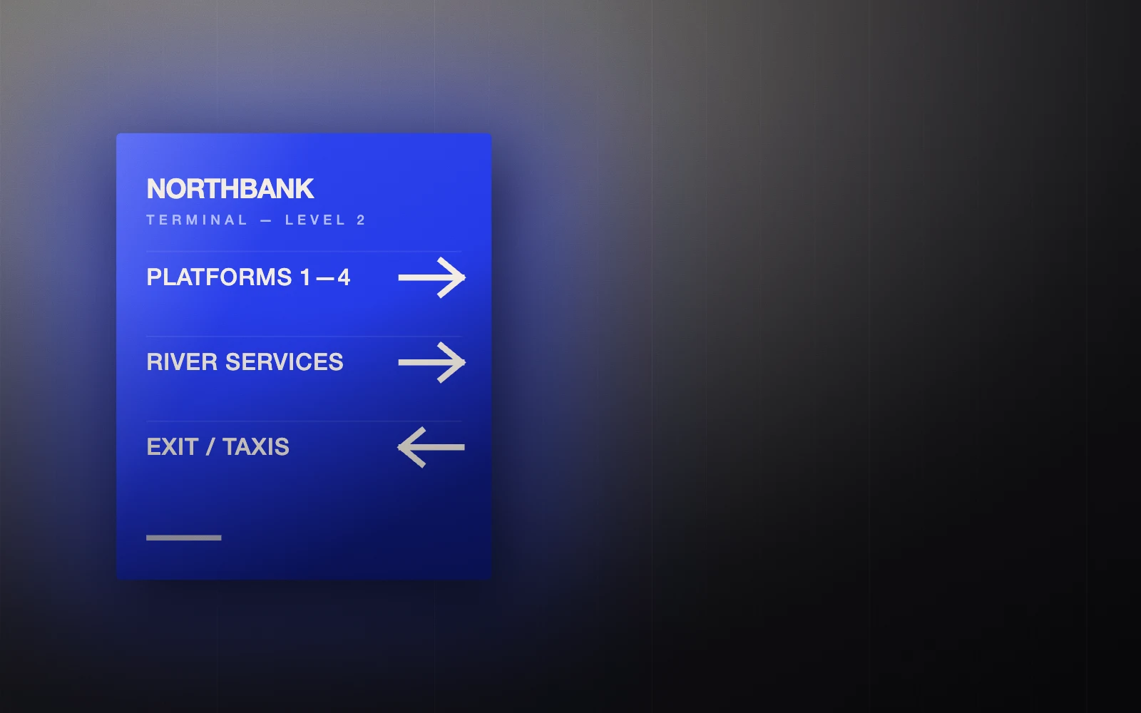
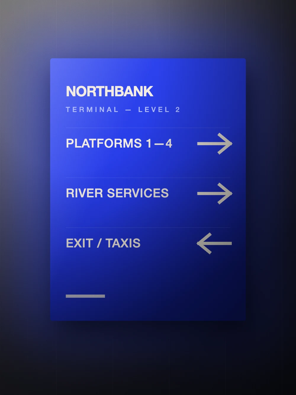
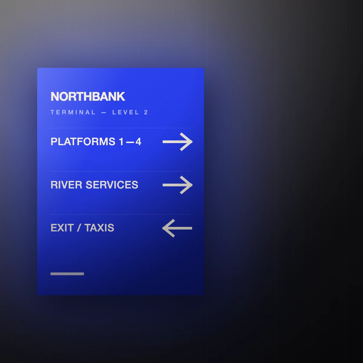
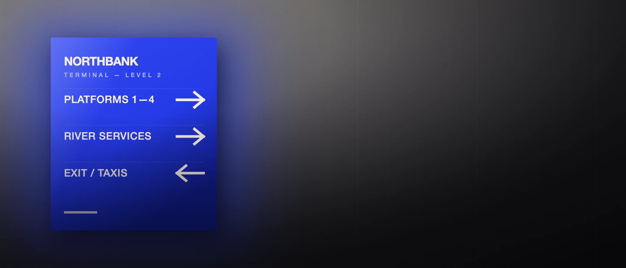
We tested every sign at the distance and speed it would actually be read. Anything that needed a second look was cut. What survived is a system of three sign classes — decision, confirmation, and detail — with a strict rule that no traveller ever needs to read more than one class at a time.
Ultramarine does the structural work. It is the only saturated colour in the building, so it reads as instruction rather than decoration, and it holds its hue under the terminal's sodium and LED mix.
The building as the grid
The terminal's structural bay is 7.2 metres. Every sign, bench, screen and floor marking sits on a subdivision of that bay, which means the system looks intentional even where it meets the original 1960s concrete. Nothing is centred on a wall; everything is centred on the structure.
Screens that behave like signs
The departure screens use the same three classes and the same typography as the painted signage, with motion limited to a single 240ms slide on data change. No transitions, no carousels, no animated attention-seeking. A screen that moves for its own sake is a screen you stop trusting.
“Complaints about getting lost dropped off our duty log. That was the entire brief.”
Who made it.
Spatial design · Wayfinding · Identity · Motion
- Creative direction
- Halvane
- Spatial and signage design
- Halvane spatial team
- Screen system
- Halvane digital team
- Fabrication
- Client-appointed contractor