Solda
A product interface with a resting state
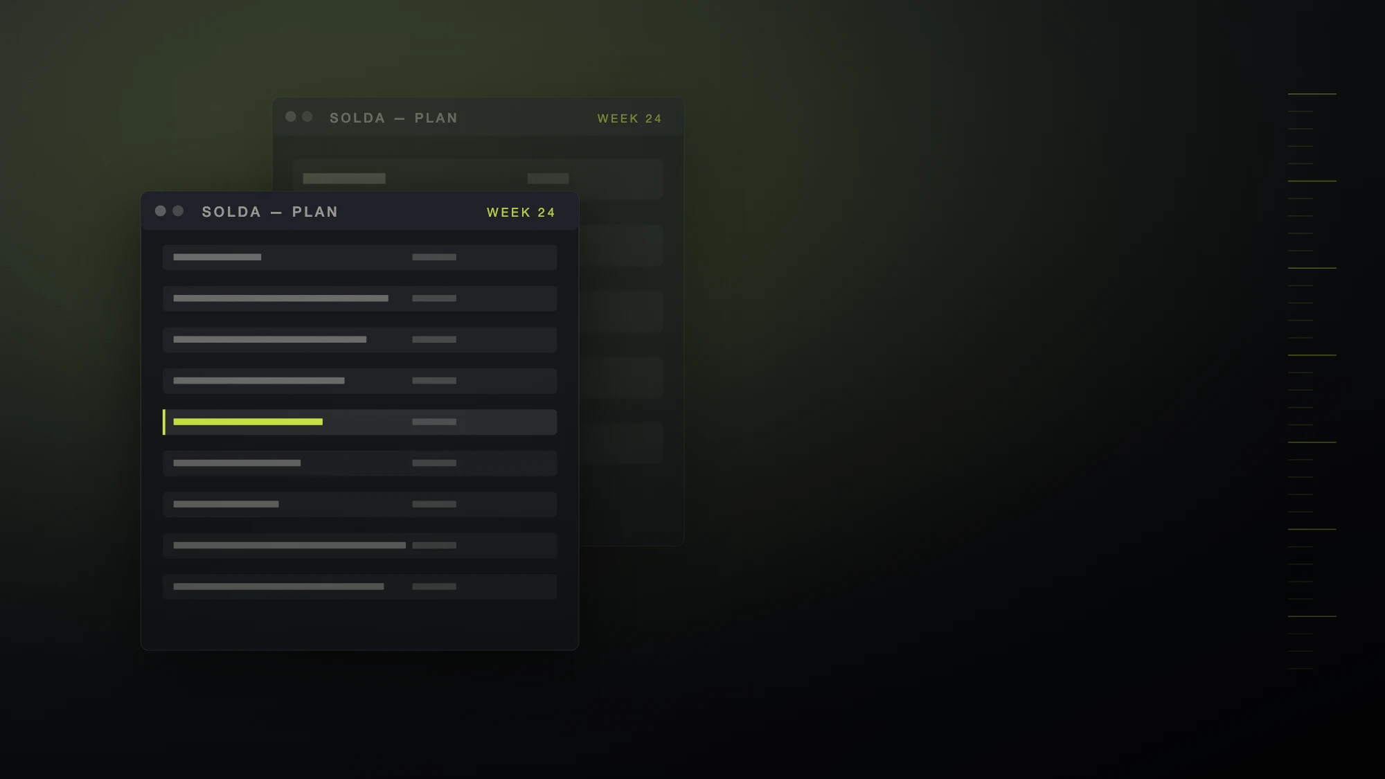
Solda's users open the tool at 8am with four things to do and close it at 6pm with sixty. Most planning tools get louder as that happens. We designed one that gets quieter.
- Product design and design system
- Web application, 6 core areas
- Component library, density spec, prototypes, hand-off
- 6 months
Density as a design axis
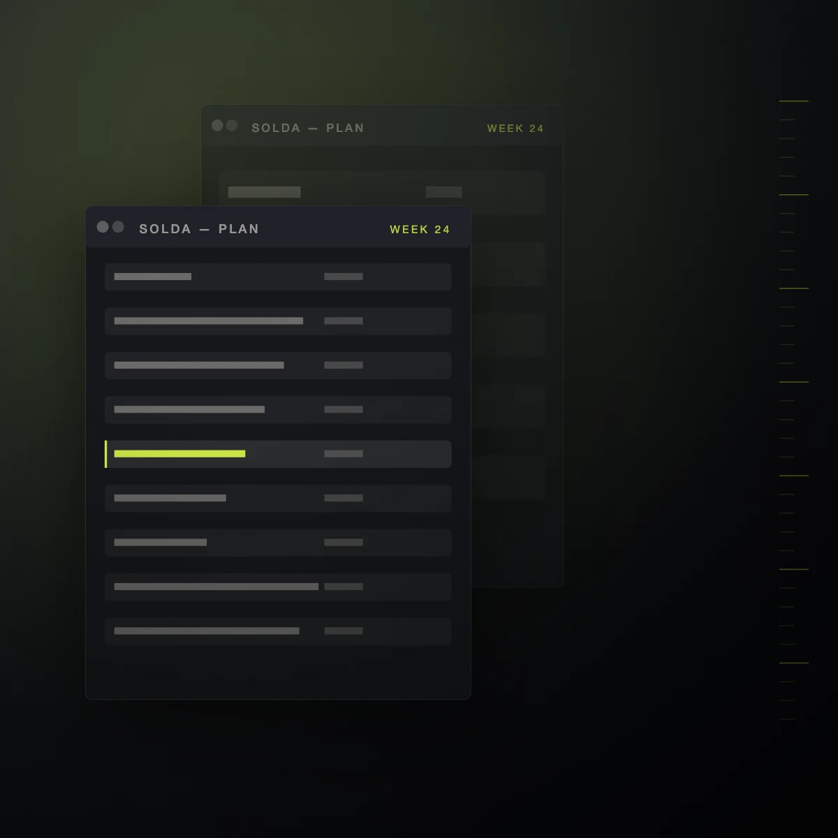
Every component in the system is drawn at three densities, and the application moves between them automatically as a workspace fills. At low density the interface is generous and explanatory. At high density labels collapse into position, chrome disappears, and colour is reduced to a single state indicator.
Nothing is hidden — the information architecture is identical at all three densities. Only the amount of interface spent on it changes.
One accent, used sparingly
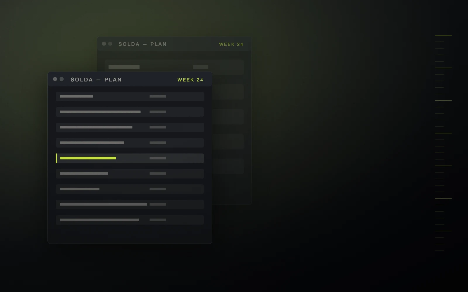
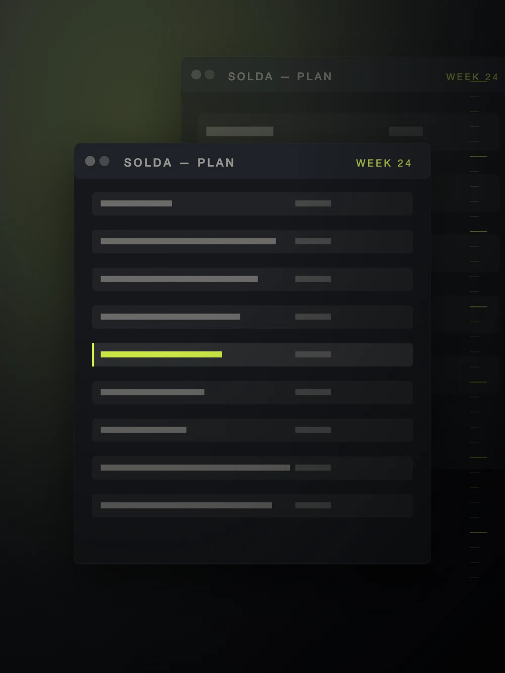
The system has exactly one saturated colour, and it is reserved for the thing that needs a decision. Everything else is a neutral. This makes the accent a genuine signal rather than a brand flourish, and it makes the product legible in a screenshot.
Designed against the real data
Every screen was designed against an anonymised export of a live workspace rather than tidy placeholder content. Half the work was finding the states that only appear at scale — a plan with 400 items, a name with 90 characters, a week with nothing in it at all.
“Our support queue lost an entire category of question. That is the result.”
Who made it.
Product design · Design system · Prototyping · Front-end direction
- Creative direction
- Halvane
- Product design
- Halvane digital team
- Design system
- Halvane with the Solda platform team
- Engineering
- Client-side