Aureus Reserve
A house style with a temperature
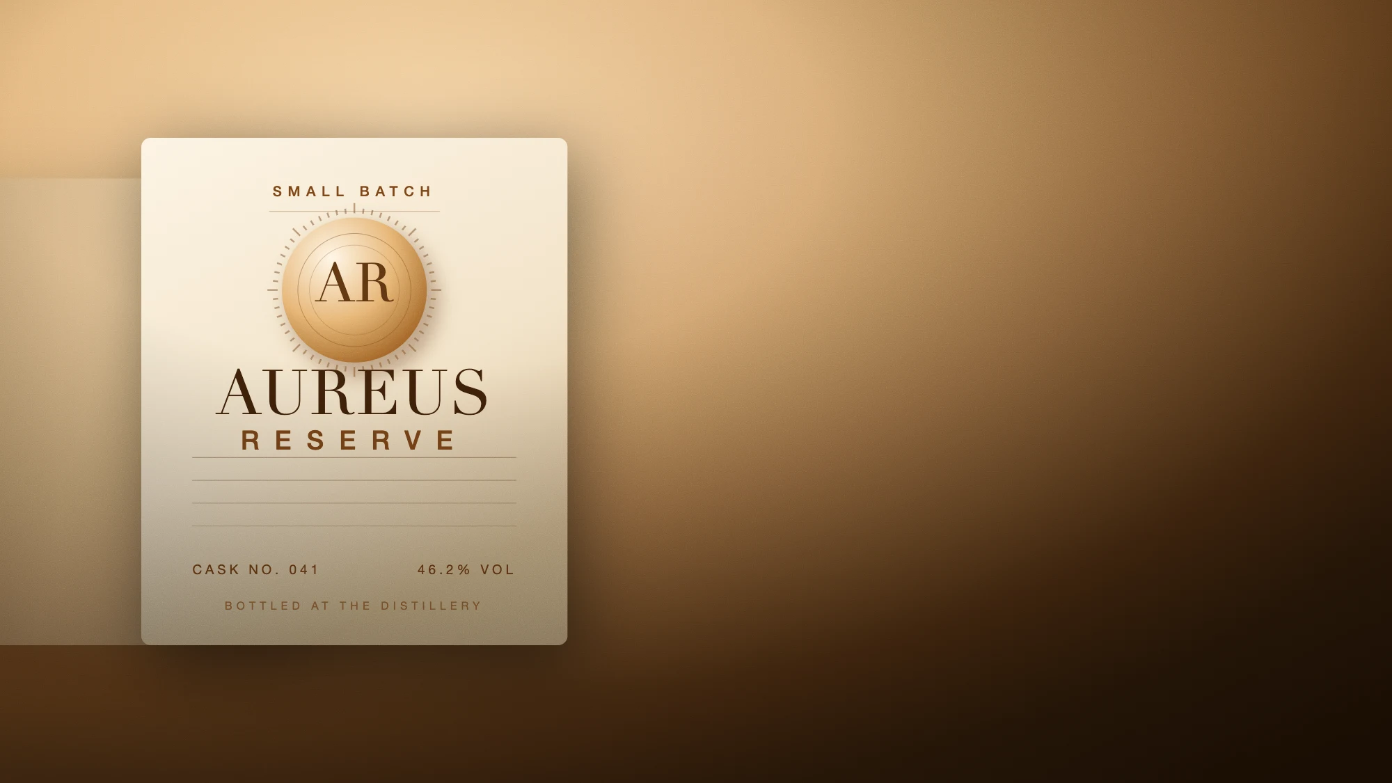
Aureus Reserve had eleven products, four labels and no argument between them. We rebuilt the house from the seal outward — one type system, one grid, one temperature — so that a bottle reads as Aureus before anyone gets close enough to read the word.
- Full identity and packaging system
- 11 products across 3 tiers
- Brand book, type system, label artwork, retail kit
- 14 weeks
Starting from the seal
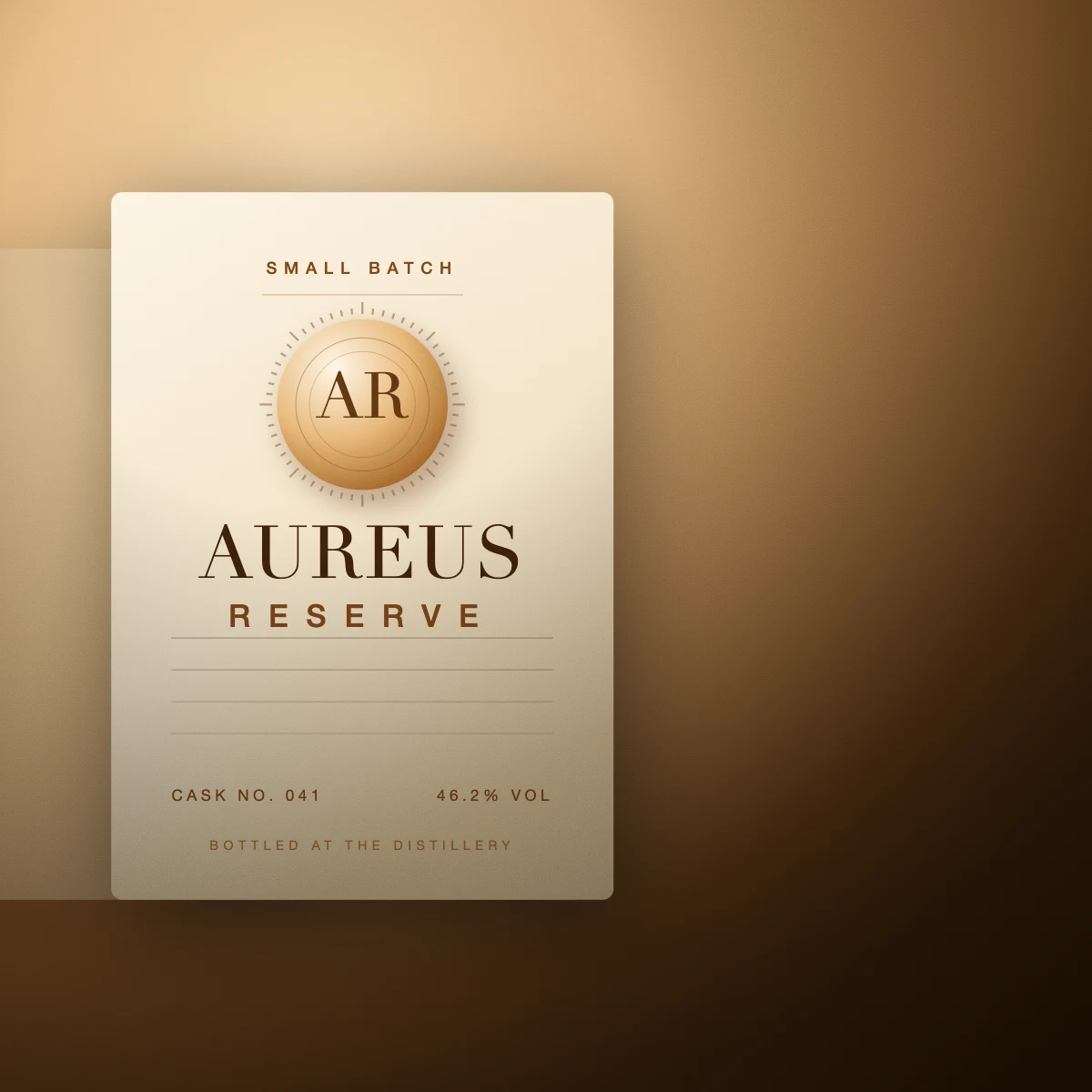
The only asset worth keeping was a pressed metal seal from the original 1971 bottling line. We redrew it at four optical sizes so it holds at 9mm on a neck label and at two metres on a wall, then derived the rest of the system from its geometry: the ring becomes the grid, the notch becomes the rule, the negative space becomes the margin.
That constraint did most of the design work. Once the seal set the proportions, every label, case, coaster and stencil had a reason to be the size it is.
One type system, four tempers
Rather than a typeface per range, we drew a single set with four weights of temperature — a cool technical cut for provenance data, a warm display cut for the range names, and two intermediates for everything in between. The range now differentiates by heat, not by font, which means a new product can launch without a new identity.
Made to be touched
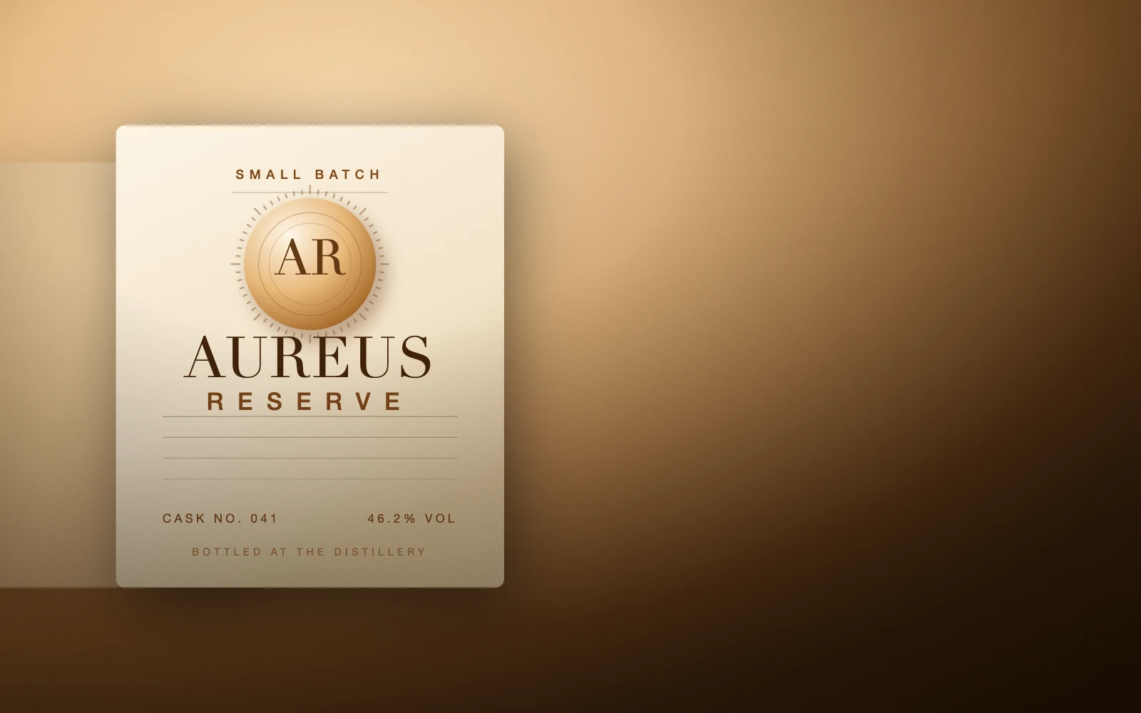
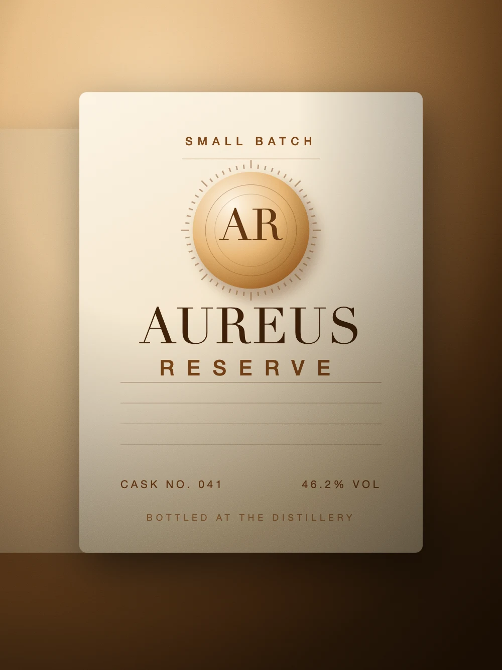
Everything was specified for an embossed, uncoated finish before it was ever specified for screen. Ink coverage was capped so the paper stays visible, the seal is a blind deboss rather than a foil, and the only metallic in the system is the liquid itself.
“We stopped explaining the range to people. They pick it up and the bottle does it.”
Who made it.
Brand strategy · Identity · Packaging · Art direction
- Creative direction
- Halvane
- Identity design
- Halvane brand team
- Type system
- Halvane with an external type foundry
- Production
- Client-side